Finding What You Wrote: Redesigning Navigation in Apple Notes
A UX case study on why Apple Notes gets harder to use the more you use it
ROLE: SOLO UX RESEARCHER & PRODUCT DESIGNER · TIMELINE: 3 WEEKS (1 WEEK RESEARCH, 1 WEEK DESIGN, 1 WEEK PROTOTYPING & VALIDATION PLANNING) · TOOLS: FIGMA, FRAMER, APP STORE/FORUM REVIEW MINING, COMPETITIVE TEARDOWN
Overview
I use Apple Notes every day but often times it ends up being random brain dumps, journaling, or reminders. Yet, I pay for an external app to take my actual notes on that doesn’t sync across my devices.
That personal experience is what sent me looking into whether other people felt the same way about the potential of apple notes. I researched across Apple’s own feedback forums, Reddit, and reviews of the app. This case study walks through the full process of coming with a redesign of features that I believe have more potential.
TLDR: Apple Notes is one of the best-designed apps for writing something down immediatetly. It is one of the weakest, among its direct competitors, at finding it again later and keeping it organized. I found three main user complaints: no scoped search, no way to link related notes, no recent-notes view, which all connect back to the main idea of organized notes. This case study fixes two of the three, on purpose, and explains why the third was deliberately left out.
1. Background: Why Apple Notes, and Why Now
Apple Notes has become one of the most-used note-taking apps in the world, mostly by default rather than by choice as it’s pre-installed, it syncs across every Apple device, and it asks nothing of you before you start typing.
But it also ends up being a brain dump of every thought that we think we should write down to remember. However, given how accessible it is, not many use it for the actual process of taking notes, most people, including me, resort to other apps. But, as humans, we’re in need of both — a brain dump and organized notes. Apple Notes has never really had to design for that outcome — its structure (folders, tags, a single search bar) was built for a much smaller, more contained use case than what its most loyal users have actually grown it into.
This case study looks into that gap — to see if there is a redesign possible that will address the use case without distrupting why people already use it.
2. Research
2.1 Method
Although this was something I have experienced, I also wanted to make sure that it was a documented gap other users were identifying. So I did a deep dive into the following resources:
Apple’s own developer and feedback forums, where users submit feature requests directly to Apple.
Reddit and general forum threads comparing Apple Notes to Notion, Evernote, OneNote, Notability, GoodNotes, and Obsidian, to see what people say when they’re actively deciding whether to leave the app.
Third-party reviews and comparison write-ups of Apple Notes from people who’d tried switching away and either stayed or came back, which turned out to be a surprisingly rich source of why people tolerate the app’s limitations.
A direct feature teardown of the four most-cited alternatives (Notion, Evernote, OneNote, Obsidian) plus Google Keep as a “stays simple” control, to understand not just what they offer but what it costs users to get it.
2.2 What I found
Three complaints kept resurfacing:
“I can’t search inside just one folder.”
A user with over 700 notes formally requested folder-scoped search from Apple, explaining that the current global-only search becomes overwhelming at that volume — you trade one long list (your notes) for another long list (your search results).
“My notes can’t reference each other.”
Users comparing Apple Notes to Evernote and Notion consistently flagged the lack of any linking mechanism. Evernote gives every note a shareable, clickable link; Notion lets you type @ or [[ to reference another page inline, which automatically creates a two-way backlink shown at the top of the linked page. Apple Notes has no equivalent.
“I have no way to see what I was just working on.”
Compared to OneNote and Google Keep, both of which surface a prominent recent-activity view, Apple Notes has nothing similar — no way to quickly return to the last few notes you touched without either remembering the folder or re-searching.
No folder-scoped search
FORUM REQUEST
“Search returns everything, all the time”
REVIEW
Can’t link related notes
COMPETITOR COMPARISON
No backlinks like Notion
FORUM THREAD
“I just re-write it instead of searching”
REVIEW
No recent notes view
COMPETITOR COMPARISON
700+ notes, one long list
FORUM REQUEST
Left Notion, missed linking
FORUM THREAD
“Retrieval is the whole problem”
REVIEW
3. Personas
To keep the design grounded in real use cases rather than abstract feature requests, I built two personas from patterns that showed up repeatedly in the research.
Priya, the Accumulator
22 · JUNIOR PRODUCT MANAGER · 6 YEARS ON APPLE NOTES
“Half the time I just rewrite it instead of finding the original. At this point I have three versions of the same list in three different notes.”
WHAT SHE NEEDS
— A way to narrow her search without first having to remember which folder she filed something in three years ago.
Marcus, the Connector
29 · GRADUATE RESEARCHER · SWITCHED FROM NOTION 6 MONTHS AGO
“I keep typing the same thing into five different notes because there’s no way to just point to the one that already has it, but the context is important.”
WHAT SHE NEEDS
— Lightweight linking that doesn’t require him to rebuild the structure he was actively trying to escape.
4. Problem Framing
Individually, Priya’s and Marcus’s frustrations look like two different feature requests aimed at two different fixes. But they’re the same shape of problem, viewed from two different habits: Priya organizes by where she put things and loses that thread over time; Marcus organizes by what relates to what and has no tool to express that at all. Both are trying to answer the same underlying question — “how do I get back to something I already wrote?” — using two different mental strategies that Apple Notes doesn’t support either way.
PROBLEM STATEMENT
Apple Notes’ navigation model was designed around the assumption that users remember where their notes live. That assumption holds at low volume and breaks down as content accumulates — and Notes has no structural mechanism (by location, relationship, or recency) to help users recover from that breakdown once it happens.
HOW MIGHT WE
How might we help long-time Notes users relocate their own content at scale, without asking them to adopt the structural overhead — folders-within-folders, tags, databases — that made them choose Notes in the first place?
That question is the actual design brief for the rest of this case study.
5. Competitive Analysis
Before designing anything, I wanted to understand what competitors offer and what it costs their users to get it. Since Notes is a free app, the features should be reflective.
APP
SCOPED SEARCH
NOTE LINKING
RECENT ITEMS
WHAT IT COSTS THE USER
Apple Notes
✕ Global only
✕ None
✕ None
Nothing — but retrieval breaks down at scale
Evernote
✓ Notebook-level
✓ Unique link per note
✓
Mature, but gated behind a subscription past a low device limit
Notion
✓ Per-page/workspace
✓ [[ ]] or @ mentions auto-create two-way backlinks
✓
Most powerful option, but users describe spending more time building structure than writing
OneNote
✓ Section/notebook-level
△ Limited, less central
✓ Prominent recent list
Less minimal visual experience than Notes
Google Keep
✕ Global only
✕ None
✓
Even simpler than Notes — same retrieval gap, no relief
6. Design Principle
Every decision from here forward is filtered through one explicit rule:
THE RULE
“Add findability. Protect capture speed.” Any solution that inserts a setup step, a forced decision, or a new screen between “I have a thought” and “it’s saved” is out of scope, no matter how much retrieval value it would add.
This is what separates this redesign from “porting Notion’s feature set into Notes.” It’s also what determines which of the three original complaints get fully designed versus acknowledged and deferred — covered in the scoping section below.
7. Information Architecture & Happy Path
Before wireframing individual screens, I mapped how the two core flows — scoped search and note linking — should sit inside Notes’ existing navigation, since the whole premise of this redesign is that it shouldn’t feel like a new app bolted onto an old one.
Happy path, scoped search (Priya’s flow)
1
Priya opens her “Apartment Hunting” folder, looking for a specific listing she saved weeks ago.
2
She taps the search bar from inside the folder — this is the key structural decision — rather than from the global notes list.
3
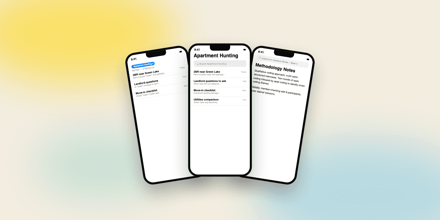
Because she entered search from within a folder, the search automatically scopes to that folder, shown as a small removable chip above the results.
4
She finds the listing in three results instead of scrolling through matches from her recipes, journal, and work folders.
5
If she needs to broaden the search, she taps the chip’s “×” once — no settings, no separate toggle, fully reversible.
Happy path, note linking (Marcus’s flow)
1
Marcus is writing a literature-review note and wants to reference a source he already summarized in another note.
2
He types [[, and an inline autocomplete of his existing note titles appears without leaving the keyboard or opening a picker screen.
3
He selects the source note; it’s inserted as a small, plainly-styled inline link — not a big embedded card, which would break the visual simplicity of the page.
4
Later, opening that source note, he sees a quiet “Linked from” indicator at the top — he didn’t have to manage this relationship himself; it was a side effect of normal writing.
5
Tapping the link jumps him directly to the source note, with a lightweight “← Back to [note title]” affordance so he’s never stuck without a path home.
SCOPED SEARCH — PRIYA
Opens “Apartment Hunting” folder
→
Taps search from inside the folder
→
Search auto-scopes; chip appears
→
Finds listing in 3 results
→
Taps × to broaden if needed
NOTE LINKING — MARCUS
Writing a lit-review note
→
Types [[ — autocomplete appears
→
Selects source; inline link inserted
→
Source note shows “Linked from”
→
Taps link; back chip returns home
8. Wireframes
I moved through three rounds of fidelity, each meant to answer a different question rather than just “make it prettier.”
Round 1 — Low-fidelity, structural
Boxes and labels only, testing whether the scope chip and the inline [[ autocomplete made sense as concepts before investing in visual polish. The main open question here was placement: does the scope chip belong above the search bar or below it? I tested both directions on paper and settled on above, since it needs to be seen before someone starts typing their query, not after.
Round 2 — Mid-fidelity, native components
Rebuilt using actual iOS list rows, the real Apple Notes typeface and spacing, and Apple’s existing yellow folder iconography, so the redesign reads as a plausible native update rather than a fantasy UI. This is also where I worked out the empty-state problem: what happens when a scoped search returns nothing? I designed a lightweight inline prompt — “No matches in Apartment Hunting. Search all notes instead?” — rather than a dead-end empty screen, since a narrowed scope should never feel like a trap.
Round 3 — High-fidelity, interactive
Final visual polish plus the states needed for a working prototype: default search, scoped search with results, scoped search with zero results, the [[ autocomplete dropdown mid-type, and the linked-note view with its back-navigation chip.
ROUND 1 — STRUCTURAL
ROUND 2 — NATIVE COMPONENTS
Apartment Hunting
Search Apartment Hunting
2BR near Green Lake
Rent includes water and garbage, no pet dep…
Landlord questions to ask
When was the last time the roof was replaced…
Move-in checklist
Document all existing damage before signing…
ROUND 3 — HIGH FIDELITY
Apartment Hunting ×
🔍 Search Apartment Hunting
2BR near Green Lake
Rent includes water and garbage, no pet dep…
Landlord questions to ask
When was the last time the roof was replaced…
Move-in checklist
Document all existing damage before signing…
BEFORE
No way to narrow this.
AFTER
Apartment Hunting ×
1 — TYPING [[
Literature Review
Source: Kavanagh 2023
Methodology Notes
2 — LINK INSERTED
Source: Kavanagh 2023
3 — DESTINATION NOTE
← Back to Literature Review
Source: Kavanagh 2023
THE UNDERLYING DATA MODEL IS RELATIONAL — THE UI NEVER SHOWS THIS GRAPH
Source: Kavanagh 2023
Literature Review
Methodology Notes
9. Visual Design Notes
Because the whole point of this redesign is that it should feel like Apple shipped it, not like a third-party skin, I held to a short set of constraints throughout:
No new iconography system. The scope chip reuses the existing folder icon and the system’s standard “x-in-a-circle” dismiss pattern already found elsewhere in iOS.
No new color introduced. The chip and link-text color pull directly from Apple’s existing system blue (used for links across iOS) and the Notes app’s own yellow, rather than inventing a new accent.
Inline over modal, everywhere possible. Both the scope chip and the [[ autocomplete happen without leaving the current screen or opening a sheet — consistent with the “protect capture speed” principle, since every modal is a small tax on the writing flow.
10. Prototype & Validation Plan
I built the scoped-search flow and the linking flow as a click-through prototype covering the happy paths above plus two edge cases (empty scoped-search results, and linking to a note that gets renamed later — the link text updates automatically, mirroring how Notion handles the same edge case).
Because this is a concept redesign rather than a shipped feature, I didn’t have access to Apple’s real user base to test against — so rather than presenting invented results, here’s the validation plan I’d run if this were headed toward implementation:
5–7 moderated sessions, split across people who described themselves as heavy Notes users (100+ notes) versus lighter users, since the whole hypothesis is that this problem is invisible until you hit scale.
Task-based testing, not opinion-gathering: ask participants to find a specific note they haven’t opened in weeks, and separately, ask them to link two related notes together without any instruction on how — watching whether they discover [[ naturally or need it pointed out.
Specific success metrics to watch: time-to-find for the scoped-search task compared against their current global search; whether participants understood the scope chip was reversible without being told; whether the [[ pattern felt discoverable to people who’d never used Notion or Obsidian, since that’s the biggest risk in borrowing a convention from power-user tools.
The failure mode I’d be watching hardest for: participants trying to use linking as a substitute for search (over-linking everything to everything), which would suggest the feature is being asked to solve a problem it wasn’t designed for, and that scoped search isn’t pulling its own weight.
VALIDATION TEST TASKS
1
Find a note you haven’t opened in weeks.
2
Link two related notes together — no instructions given.
11. What’s Out of Scope, and Why
A reviewer should be able to see the edges of this work as clearly as the work itself — this is where I draw them explicitly:
No graph view. A visual web of connections is genuinely powerful in Obsidian and useful to some Notion users, but it directly contradicts the design principle this whole project is built on. The linking model here is meant to stay invisible until someone needs it, not become a new surface to maintain.
No databases or note properties. These solve a structured-data problem. The problem identified in this research is retrieval of freeform notes — a different problem, and one that databases would over-solve at a real cost to simplicity.
Recent-notes view and a web clipper are real, evidenced pain points from the research (the third original complaint, plus a related gap around one-click web capture) but they’re additive UI — a new list, a new share-sheet action — rather than symptoms of the structural navigation problem this case study targets. I’d treat both as a strong, low-risk fast-follow, not part of this scoped redesign.
Cross-platform support (Windows/Android) is a real limitation people cite when choosing alternatives, but it’s a platform/business decision, not a navigation-model problem, so it sits outside this case study entirely.
12. Reflection
The actual design challenge here was never “how do I add search scoping and linking” — both are well-understood, already-solved patterns elsewhere. It was resisting the pull to solve them the way Notion or Evernote does, because importing their solution wholesale would also import the exact complexity that Marcus, and a lot of people like him in the research, left those tools specifically to get away from.
If I’m honest about what I’d do differently with more time: I’d want real usability data before being confident the [[ pattern is discoverable to someone who’s never touched Notion or Obsidian — that’s a borrowed convention, and borrowed conventions are exactly the kind of assumption that looks obvious in a case study and falls apart in a test session. That’s precisely why it’s the first thing in the validation plan above rather than an afterthought.
The broader lesson I’m taking from this project: the hardest and most valuable part of this kind of redesign isn’t finding what to add. It’s holding a scope line firm enough to actively cut features that are individually good ideas — a graph view, database properties — because they’d undermine the one thing the product was actually right about to begin with.
Root cause: retrieval doesn’t scale
→
Principle: add findability, protect capture speed
→
Solution: scoped search + lightweight linking
ARISHA GUPTA © 2026 — SEATTLE, WA